Problem
Free trial users previously encountered a friction point upon reaching the 3-member team limit. They were presented with an error modal that restricted further invites without a clear conversion path to upgrade to a paid plan. This lack of clear user onboarding and conversion optimization led to several negative outcomes:
Increased customer support load: Users struggled to find upgrade options, resulting in an influx of support tickets requiring manual explanation of paid features. This created unnecessary workload for the customer support team.
Low conversion rate: Unclear upgrade messaging discouraged users from converting to paid plans, leading to unused accounts and missed revenue opportunities.
Silent churn: The frustration caused by the error message likely caused some users to abandon the platform entirely, without contacting support (passive churn). This lack of user feedback made it difficult to measure the full impact of the problem.
Data gathering
Our initial review of the data highlighted a significant issue: a substantial drop-off at the 3-member team limit. Research showed that:
85% of the teams chose inaction, resulting in a failure to convert and abandoned teams. They were either confused about how to proceed or dissatisfied with the available options.
Feedback on modal interactions suggested that users felt restricted and unsure about their next steps, which likely contributed to their decision not to upgrade.
To understand the root of these issues better, we conducted targeted user interviews, focusing on their experience at the point of receiving the limit-reach modal. Key findings included:
Initial confusion: Users were often surprised and confused by the modal, not expecting to encounter a limit so abruptly.
Seeking clarity: Users expressed a need for more transparent information regarding what they could achieve with an upgraded plan.
Alternative options: Many teams expressed a need for a budget-friendly paid plan options to test their workflows.
Notably, we identified a delay in decision-making due to payment approvals, which were typically handled by separate finance departments, causing further delays in value realization.

Strategic solution development
Guided by these insights, our team devised a strategy to enable users to continue their experience seamlessly by:
Introducing an immediate trial activation option to bridge the gap caused by external payment approval processes.
Refining the user journey within the modal to enhance clarity and reduce perceived barriers.
Solution explorations
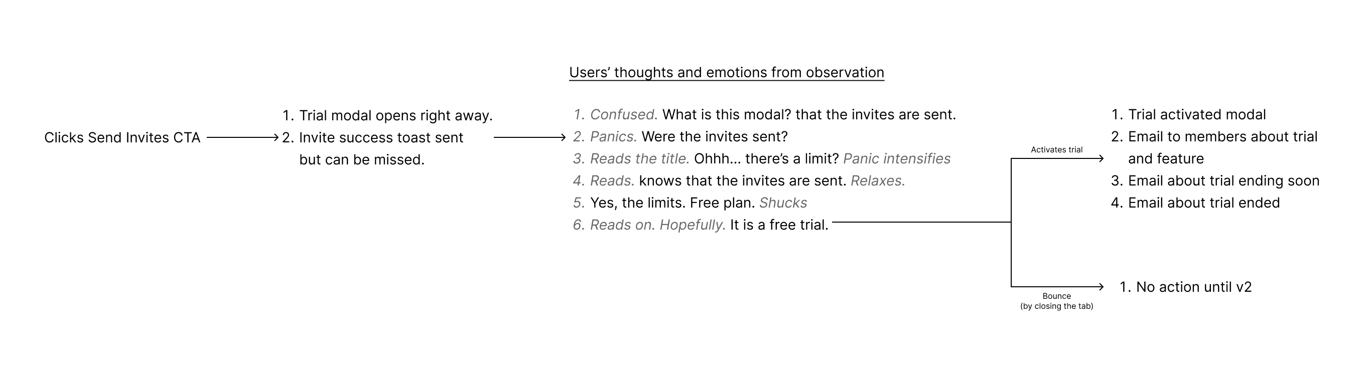
To validate this new approach, we conducted follow-up usability testing with a closed user group. The results were positive. By observing user behavior and gathering feedback, we were able to make crucial design refinements.
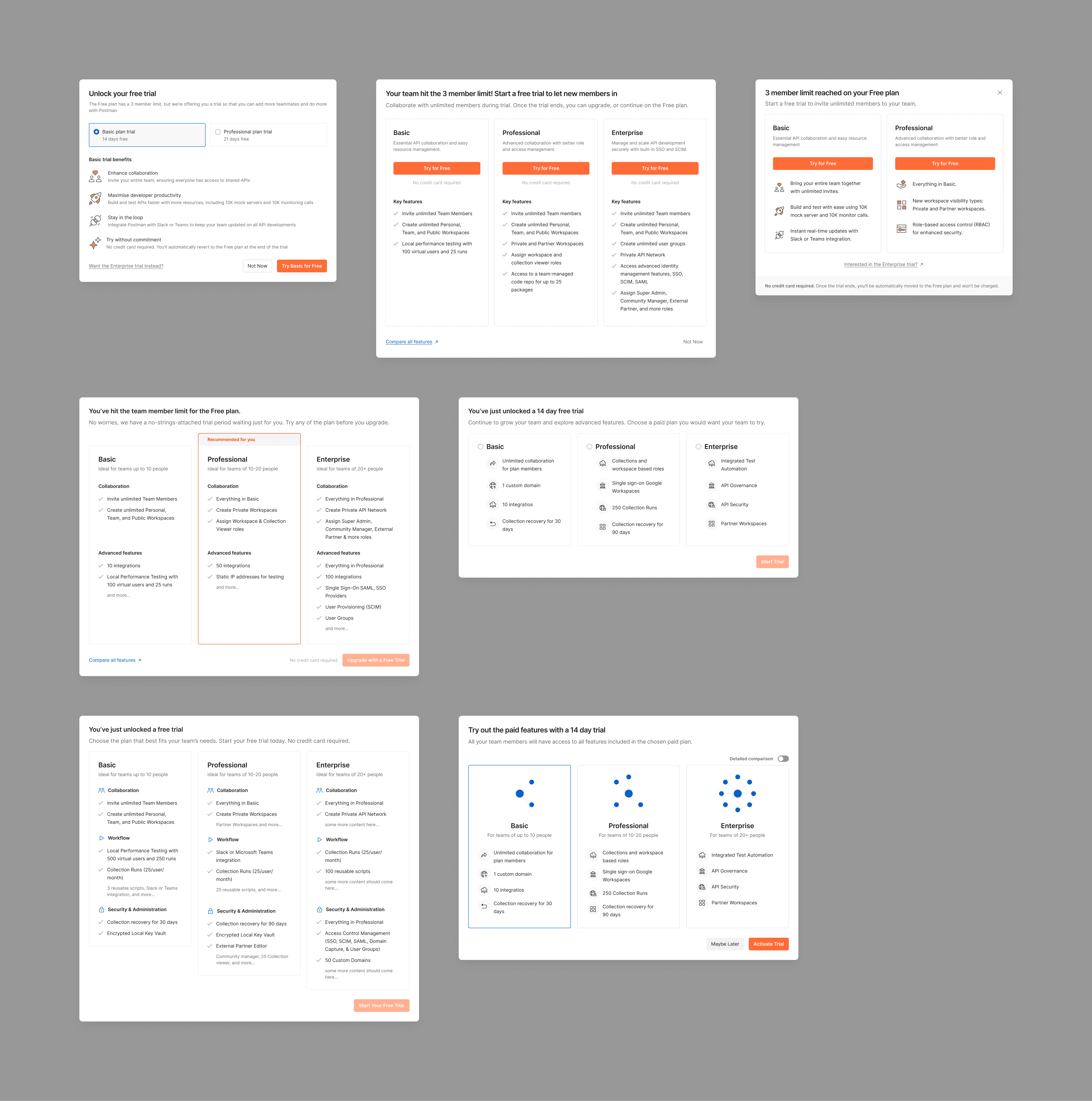
Nailing down the design
Optimizing user conversion through effective modal design
We introduced a modal to help users to clearly understand the reason and transition to trial when they hit the limit of three team members. Our aim was to make the trial activation more noticeable and the messaging more relatable.
Contextual clarity: The content in the modal explains why the trial is being offered at this crucial point, helping to clear up any confusion and setting the right expectations for what the users can do next.
Visibility and attention: We designed the trial activation button to stand out using bold colors and prominent placement, ensuring it grabs user attention right away.

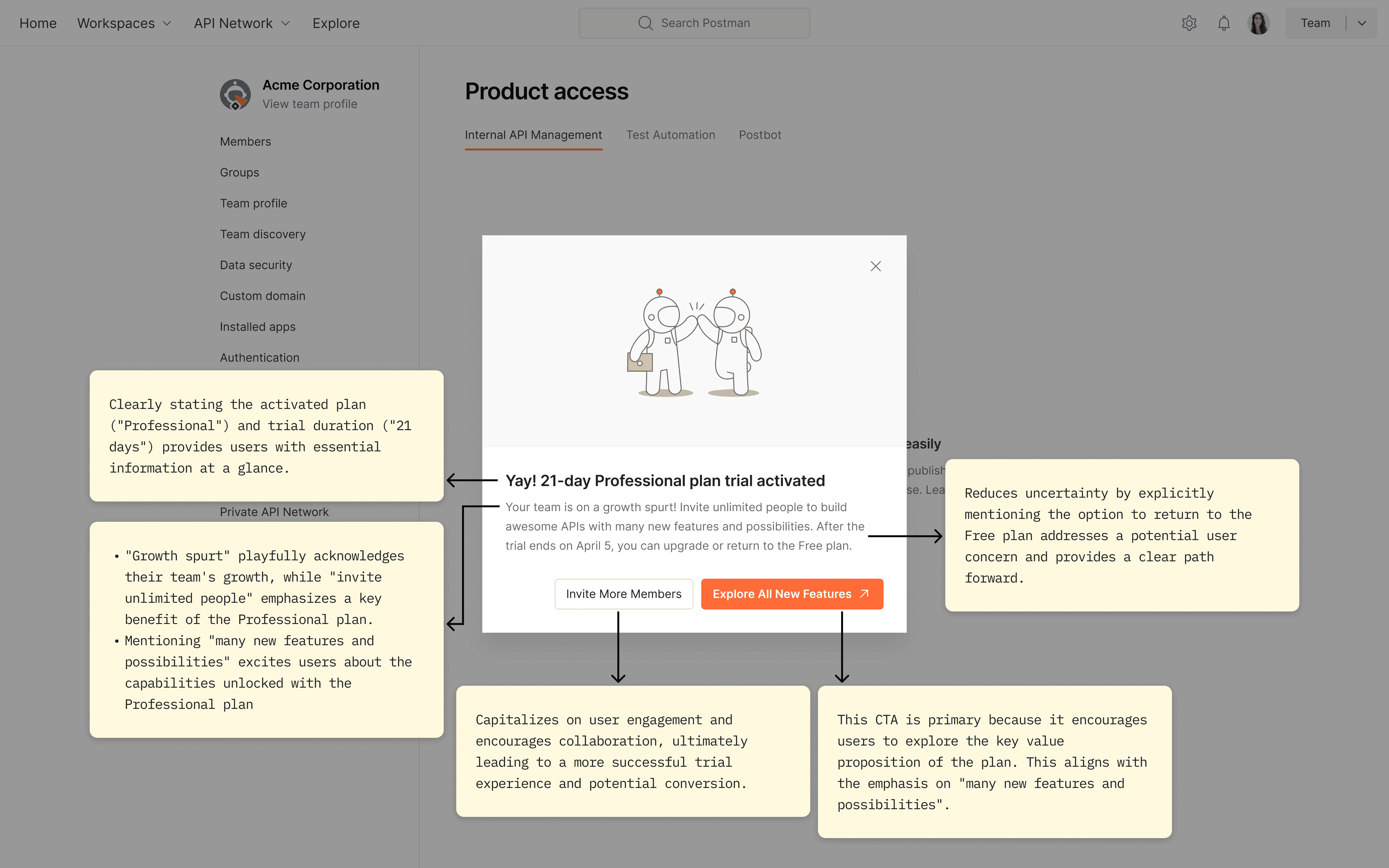
Increasing trial engagement through follow-up modal
After presenting the initial upgrade modal, we introduced a follow-up congratulatory modal. This modal was meticulously designed to enhance user engagement through several key strategies:
Re-emphasizing available actions and benefits: The modal reiterated the expanded capabilities and benefits of the trial, ensuring users are fully aware of what they can now access and achieve.
Encouraging immediate engagement: By presenting direct and appealing calls to action, such as inviting more team members and exploring new features, the modal motivates immediate interaction, fostering deeper exploration of the platform.
Clear communication of the trial end date: Transparently stating the trial’s expiration date helps set user expectations and provides a clear timeline, encouraging users to make the most of the trial period without any surprises.
These elements work collectively to mitigate any potential post-decision dissonance, reinforcing the user’s decision to engage with the trial. By clearly outlining the next steps and actively promoting the trial's expanded possibilities, the modal not only enhances the user experience but also drives higher engagement and potential conversion rates.
Research insights
Finally, we implemented this new flow with the closed group and mapped out the users' emotions, and it worked in our favor. We followed up with personal interviews with a few people and found that some of the content decisions and how they were presented helped make the decision easier.
Focused communication: Highlighting key plan differences without overwhelming users with excessive details.
Clear trial activation reasons: Explicitly addressing the 3-member limit, which was previously unknown to many teams.
No credit card requirement: Adding this information proved crucial in reducing user anxiety about committing.